While Tasks and Projects saw strong usage, higher-level objects like Portfolios and Goals were underutilized. A key barrier was the lack of visibility and navigation across the work hierarchy.
I led the redesign of the breadcrumb system to bridge this gap, enabling users to understand and navigate relationships between work objects. This led to improvements in Portfolio adoption, deeper engagement with Project workflows, and a positive directional impact on net ARR.
IMPACT AT A GLANCE
WHY THE DATA MADE THIS HARD
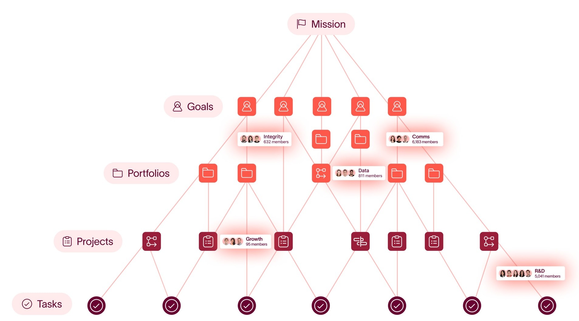
Most breadcrumb systems assume a clean, one-to-one hierarchy: one parent, one child. However, Asana’s object model is much more complex:
How might we help users understand and navigate hierarchical relationships in a system where objects can have multiple parents and non-linear structures?
I led the design of the breadcrumb system from concept to MVP, defining how users understand and navigate relationships across work objects. This included framing the problem, exploring interaction models, and making trade-offs between usability and the constraints of a complex, many-to-many data model. I worked closely with engineering, product, and data partners to validate feasibility, map edge cases, and ship the first iteration under tight timelines.
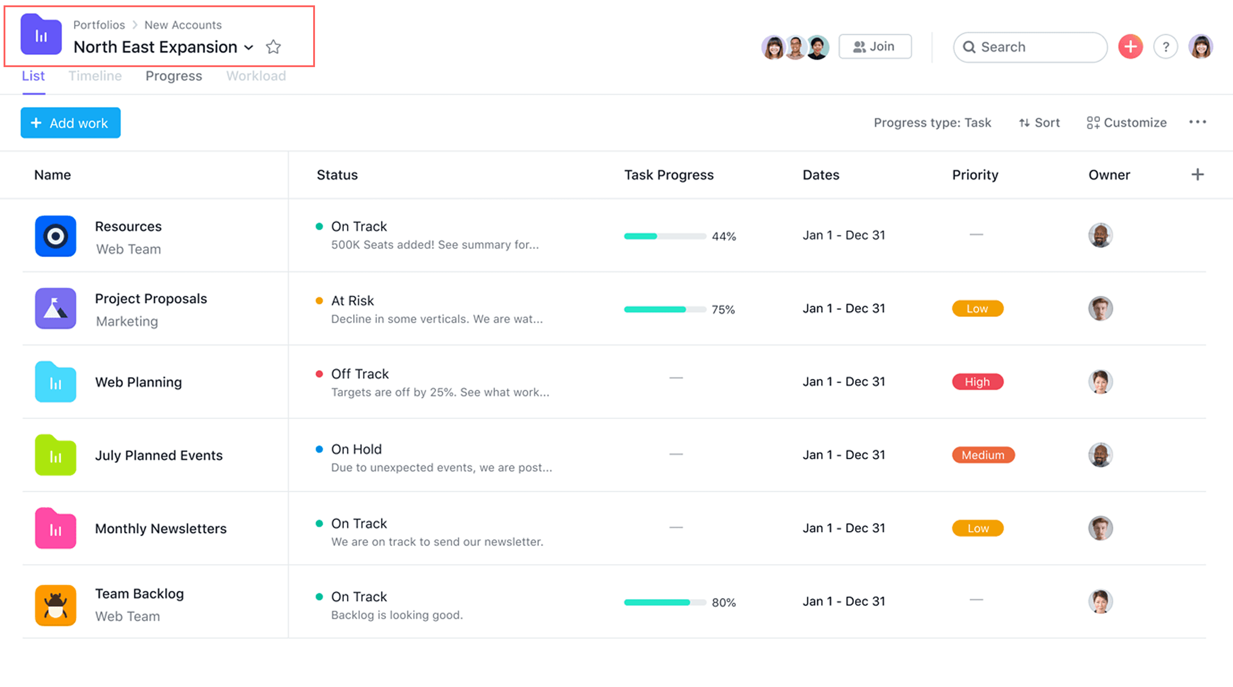
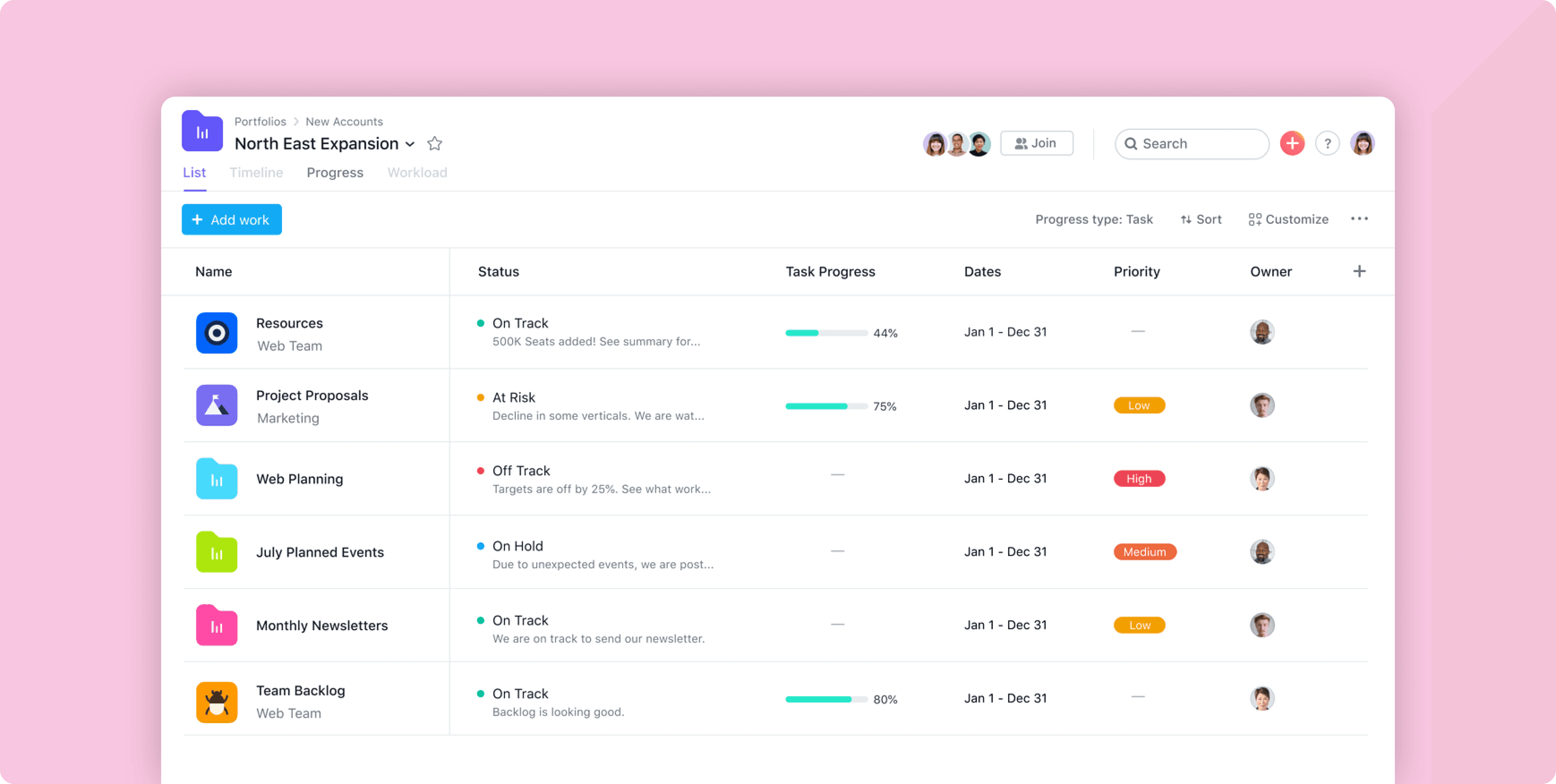
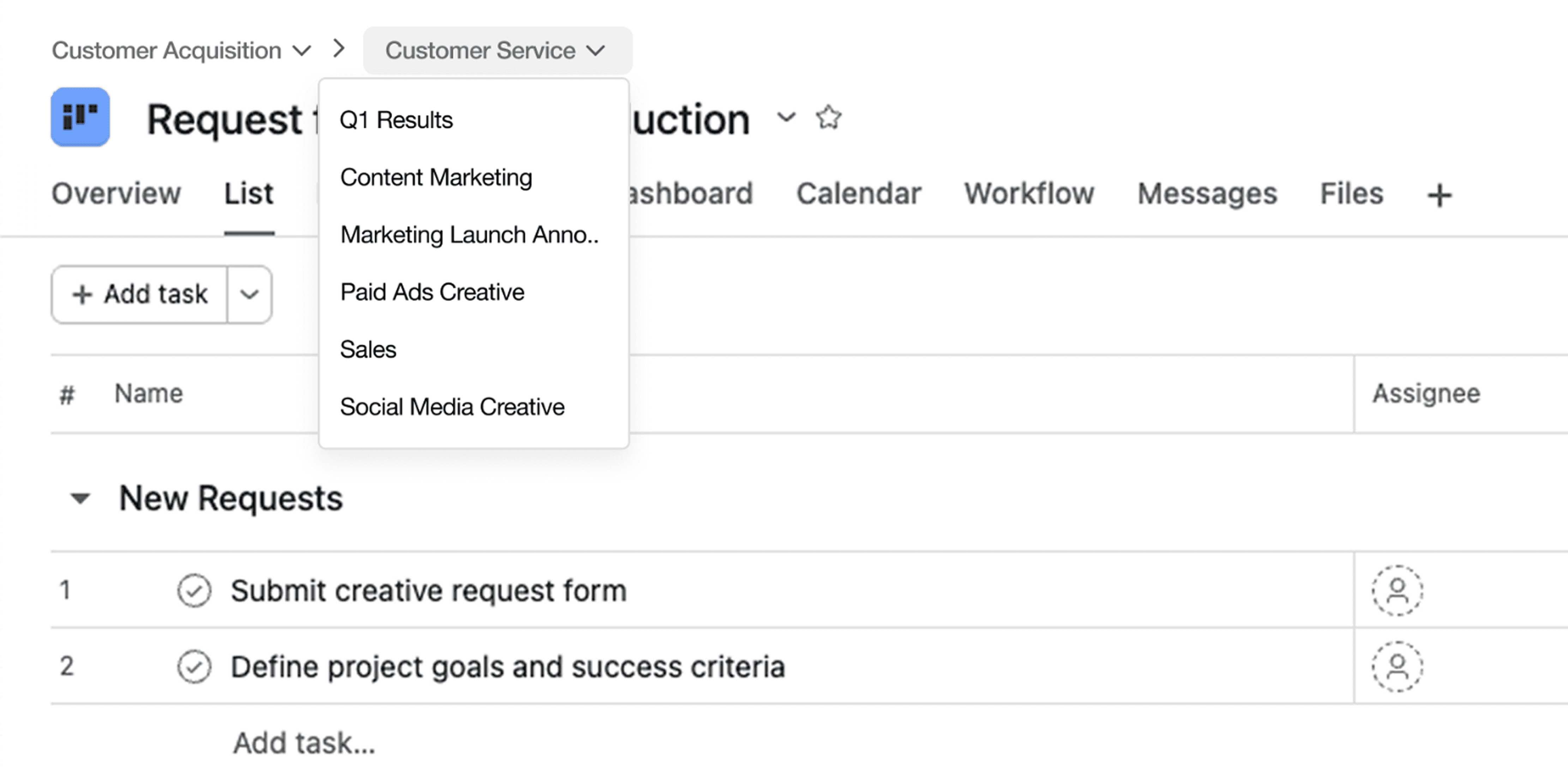
Breadcrumbs on Portfolios
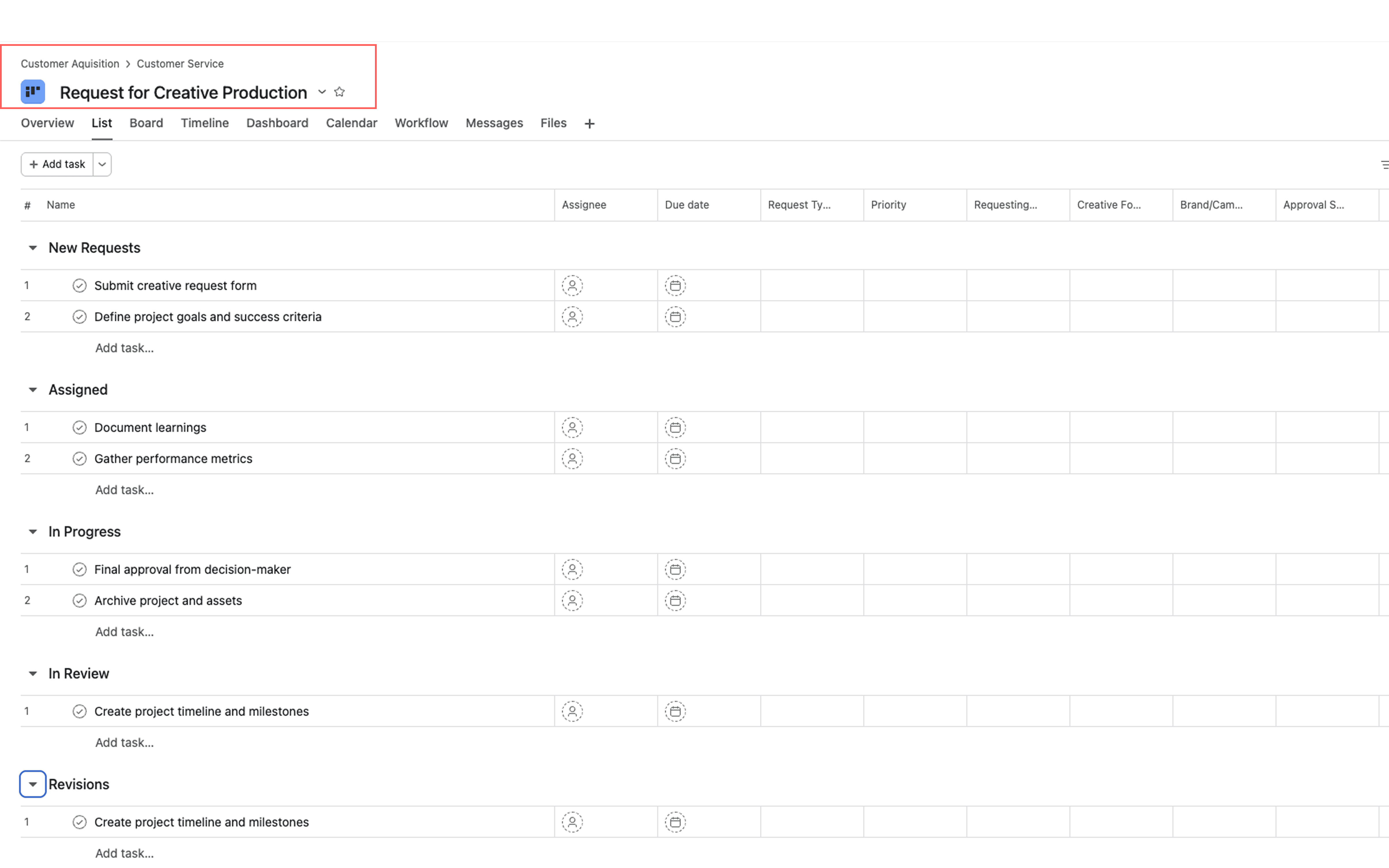
Breadcrumbs on Projects
In the first iteration, I prioritized surfacing as much of the object hierarchy as possible, allowing users to see how their work connected across goals, portfolios, and projects. I explored ways to represent multiple parent relationships, including dropdowns and expanded paths, to reflect the underlying data model.
This approach focused on contextual awareness, ensuring users could understand how their work fit within the broader system, but introduced complexity that made navigation more difficult.
RESOLVING A CRITICAL DESIGN CONSTRAINT
Mid-development, we discovered that our initial approach could produce breadcrumb paths that did not actually exist in the underlying data. Resolving this required both redefining the design approach and aligning stakeholders across product and engineering on a new direction.
Our initial approach showed all objects in the breadcrumb Goals > Portfolios > Projects and determined what to show at each level by independently looking up every Goal, Portfolio, and Project the belonged to. The problem: because a Project can belong to a Goal directly, skipping Portfolios entirely, this approach could produce a breadcrumb path like Goals > Portfolios > Projects that looked valid but didn’t actually exist in the data.

I proposed constraining the design to Projects and Portfolios, ensuring all visible relationships were valid. Because Goals behave differently from other work objects, removing them reduced complexity without materially impacting the user experience. I was able to align stakeholders within two weeks of the issue being flagged. The agreed scope shipped on a tight timeline, and the decision to descope Goals became one of the defining design principles of the final product.
After shipping the MVP, we realized that our first iteration had optimized for one interpretation of "context": surfacing as much of the object hierarchy as possible so users could see how their work connected upward. The problem was that showing so much hierarchy made the breadcrumb very hard to actually navigate. Users were getting contextual awareness, but at the cost of usability.
WHY WE NEEDED TO SHIP V1 FIRST
Some of what we built in v2 had been considered earlier but deemed too expensive to justify without evidence. V1 was deliberately scoped for speed, not because we hadn’t thought about a better solution, but because we needed real user feedback to make the case for the additional investment. It wasn’t until we shipped v1 and saw how the design actually felt in practice that the problem became concrete enough to act on. The solution in v2 wasn’t a surprise, but the justification for building it was.
The second iteration had to answer a more precise question than the first: how do you surface enough of the hierarchy that users understand where they are, without surfacing so much that navigation becomes confusing?
The MVP made it clear we had over-indexed on the first at the expense of the second. Getting that balance right required rethinking the design more substantially than a quick fix, which is what prompted bringing in another staff designer. I worked with the staff designer to land on a solution that resolved the tension between awareness and navigation: standardize a single breadcrumb across all object surfaces, showing only the most recently visited object at each level rather than a dropdown of all possible parents.
Nested portfolio
Not nested portfolio
WHY THIS WORKED
Showing the most recently visited object gave users enough context to see that an underlying hierarchy existed (ie. their task connected to a project, which connected to a portfolio) without overwhelming them with every possible path. The breadcrumb formed a coherent, navigable trail that reflected how the user had actually been working, rather than exposing the full complexity of the data model all at once. Awareness and navigation were no longer in conflict.
This project shaped how I think about the relationship between design complexity and organizational complexity and how each can surface the other.
MVP AS A DESIGN TOOL, NOT JUST A DELIVERY SHORTCUT
The decision to ship an MVP and use it to surface gaps was one of the best calls on this project. Abstract stakeholder feedback is hard to act on. A working product, even if imperfect, makes conversations specific. I’d use this approach deliberately in future projects, especially when stakeholder vision is unclear or hard to articulate upfront.
DEFINE THE UX QUESTION PRECISELY BEFORE DESIGNING
In retrospect, our core design question "How do we provide contextual information via breadcrumbs?" was underspecified in a way that caused friction throughout the project. Context can serve two distinct purposes: giving users awareness of where an object sits in the hierarchy, or enabling users to navigate between those objects efficiently. These are related but meaningfully different goals, and they lead to different design decisions. We didn’t make that distinction explicit at the start, which meant different stakeholders were implicitly optimizing for different things. Sharper problem framing upfront would have surfaced that ambiguity earlier and reduced the iteration cost significantly.